Managed Solutions Identity
New visual identity and go-to-market strategy unifying staffing and consulting businesses. My roles: research, brand strategy, creative direction, user validation testing, template and production oversight
The Brief
The challenge: Both businesses have separate go-to-market brand strategies, let alone look and feels. At some point in the funnel customers engage with both brands which creates a confusing experience. Additionally, both businesses have worked with agencies to develop materials ad hoc over five years. In the absence of a unifying brand and visual strategy, there was no consistency in style, messaging or alignment with brand story.
Direction: Develop a unifying design strategy that’s impactful, visually infuses our brand platform and stands out from staffing and consulting competitors. It should inspire and allow for distinction between four brand segments. What’s not in scope: messaging or a logo. That will come later.
Research & Brainstorm
There were multiple executive stakeholders from both businesses, each with a unique perspective on the visual strategy. After kickoff, I guided my art director team through persona development to ensure all recommendations (and feedback) were user-centric.
I then led the team in competitive research and analyzing existing assets. We considered what worked, where we could leverage equity (if at all) and opportunities to stand out. From there we started work on style scapes.
COMPETITIVE ANALYSIS & EXISTING MATERIALS
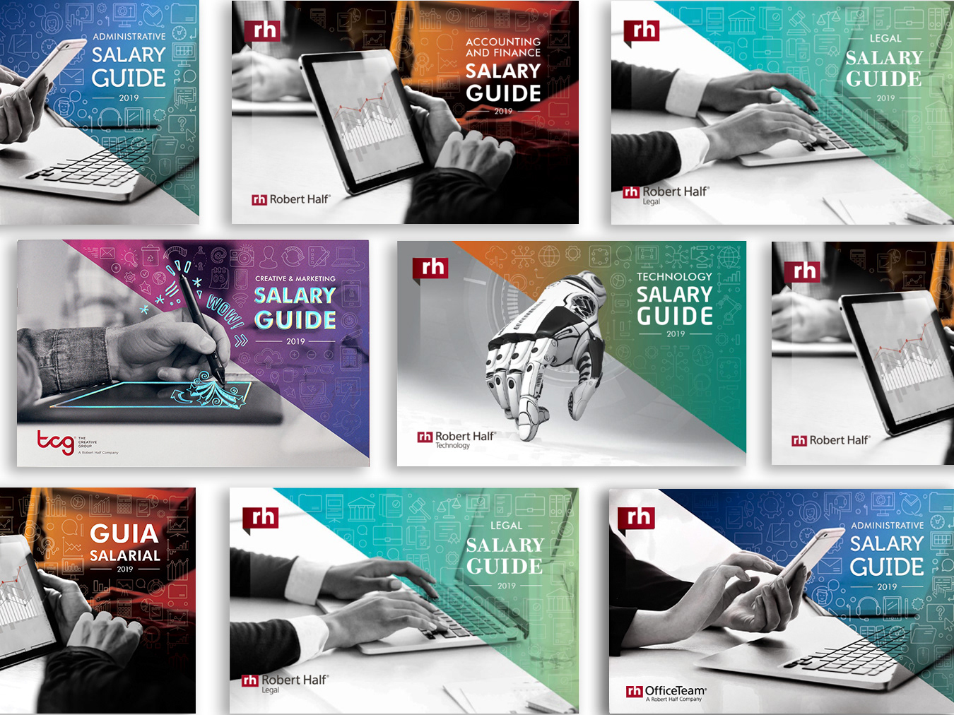
Our research showed that competitor branding was either abstract or corporate. Many leveraged dark colors with attractive type, metaphoric or stock office photography, and small pops of color. We took that into consideration as we reviewed our existing materials (below).
Strategy & Development
We explored many options – using colors from both brands, limited color, black and white, photos and no photos, color coding and no coding. Below are some of our style boards. I identified a creative lead to help spearhead user validation testing, which confirmed the 1st and 3rd concepts as our most viable.
Concepts
Visual Identity
New challenge: The business liked the idea of limited color but senior leadership was divided on a visual approach. As a compromise, they asked us to explore a simple design with a blue-to-green gradient and a dot pattern.
The yellow featured on the website is not part of the overall design system. It's an uneditable master component of the website.
Landing page
Assets
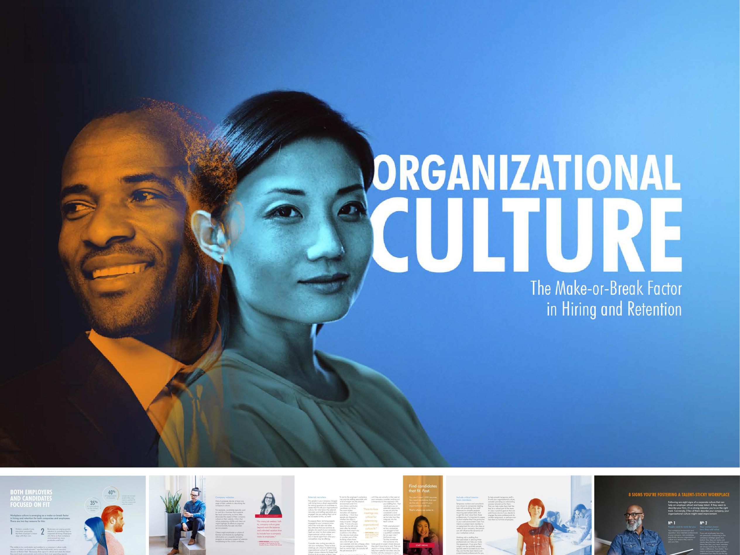
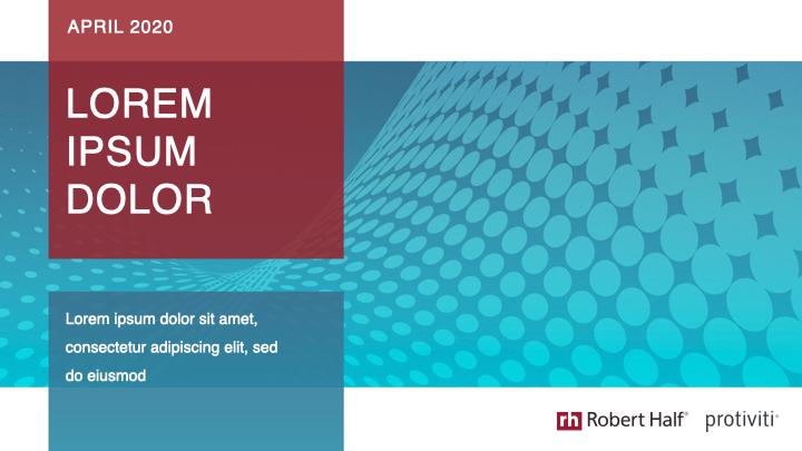
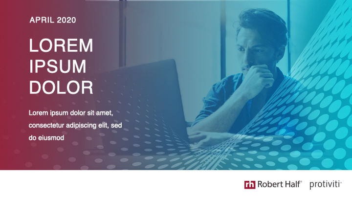
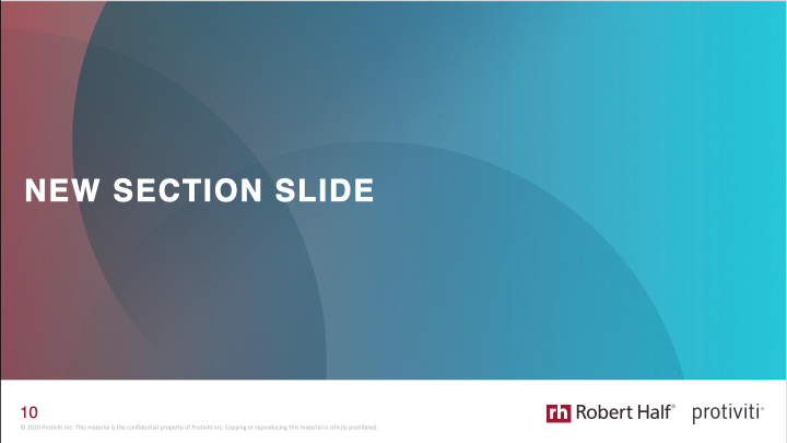
Here is how the design system pulled across other materials.
Webpage
Email and email signature banner
Flyer
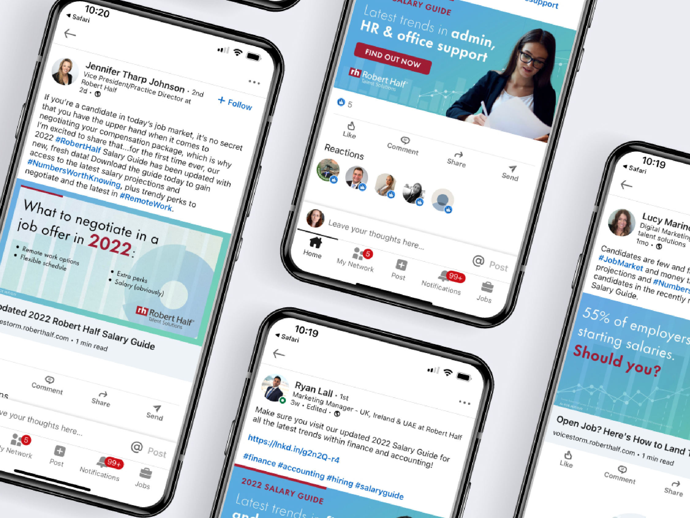
LinkedIn profile
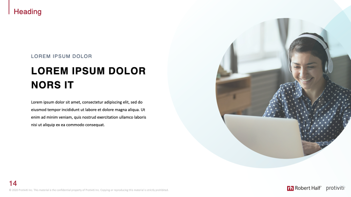
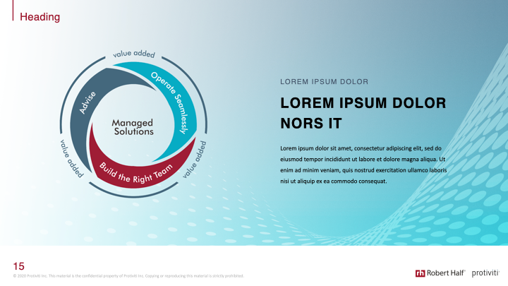
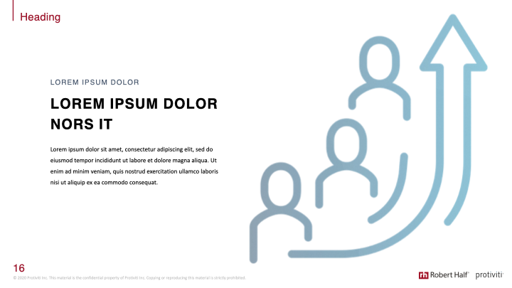
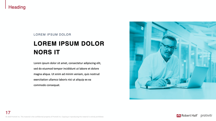
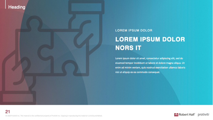
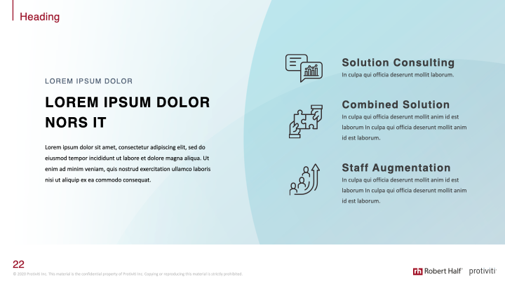
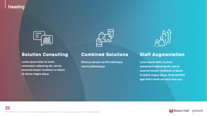
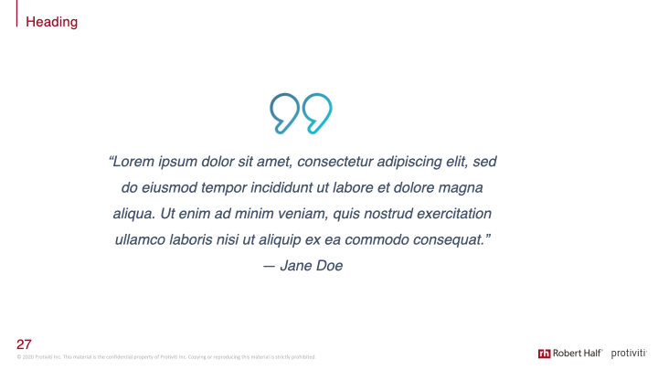
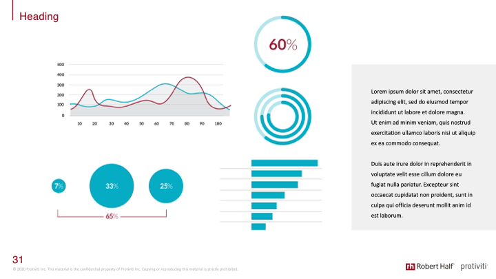
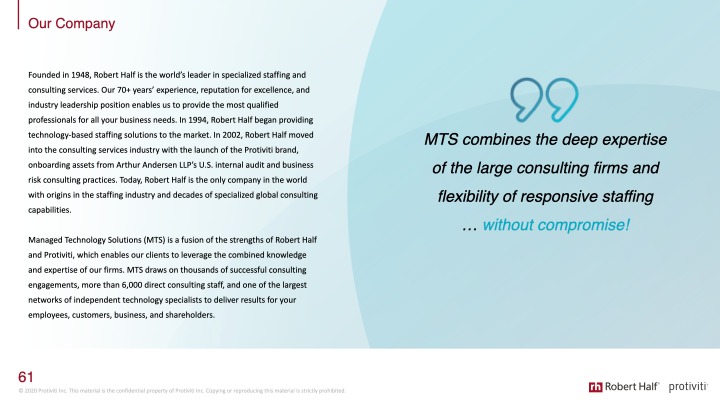
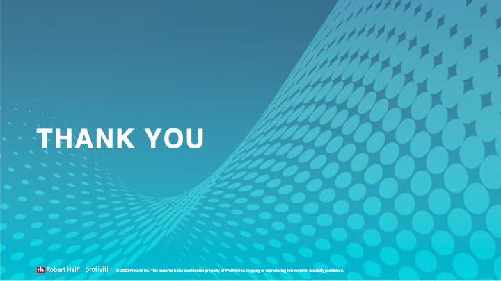
Pitch deck template
Results
Thanks to the updated and simplified look, Managed Solutions became the most profitable business for several years. It was easier for customers to recognize and connect materials regardless if they came in through the Protiviti or the Robert Half funnel.

